---
title: "Props configuration"
slug: "vpe-props-setting"
updated: 2026-09-17T09:22:39Z
published: 2026-09-17T09:22:39Z
canonical: "guide.ncloud-docs.com/vpe-props-setting"
stale: true
---
> ## Documentation Index
> Fetch the complete documentation index at: https://guide.ncloud-docs.com/llms.txt
> Use this file to discover all available pages before exploring further.
# Props configuration
Available in Classic and VPC
This page describes the properties available for configuring the player.
Note
This applies to both Android and iOS.
## devTestAppId
VPE is configured with an app ID-based license. This property allows you to work in the development environment by setting a development-only app ID.
```
```
## accessKey
Sets the VPE license key.
```
```
## platform
The VPE React Native SDK supports public (pub) and government (gov) platforms. The default is public (pub).
```
```
## events
The VPE React Native SDK provides features to bind player events.
```
{
console.log('player ready')
},
fullScreen: (data) => {
setIsFullScreen(data.isFullScreen);
},
timeupdate: (data) => {
console.log('Total duration of the video (duration): ', data.duration);
console.log('Current playback position (currentTime): ', data.currentTime);
console.log('Current playback percentage (percent): ', data.percent);
console.log('Accumulated playback time (viewingTime): ', data.viewingTime);
console.log('Playback source type (sourceType): ', data.sourceType); // Playback source type (vod, live)
},
nextTrack: (data) => {
console.log(data);
},
prevTrack: (data) => {
console.log(data);
},
volumechange: (data) => {
console.log(data);
},
play: () => {
console.log('play');
},
pause: () => {
console.log('pause');
},
ended: () => {
console.log('ended');
},
controlbarActive: () => {
console.log('controlbarActive');
},
controlbarDeactive: () => {
console.log('controlbarDeactive');
},
error: (data) => {
console.log('error', data);
},
}}
...
>
```
| Event | Description | Return value |
| --- | --- | --- |
| ready | Player loaded. | - |
| fullScreen | Occurs when entering full screen mode. | data.isFullScreen == true , false |
| timeupdate | Occurs during playback. | - duration: Total duration of the video - currentTime: Current playback position - percent: Current playback percentage - viewingTime: Accumulated playback time - sourceType: Playback source type (vod, live) |
| nextTrack | Occurs when moving to the next video. | Next video source |
| prevTrack | Occurs when moving to the previous video. | Previous video source |
| volumechange | Occurs when the player volume changes. | Mute status |
| play | Occurs when playback starts. | - |
| pause | Occurs when playback is paused. | - |
| ended | Occurs when the current video ends. | - |
| controlbarActive | Occurs when the control UI is activated. | - |
| controlbarDeactive | Occurs when the control UI is deactivated. | - |
| error | Occurs when a player error occurs. | - error_code: Error code - error_message: Error message |
## options
Sets VPE player options.
```
```
- VPE player options are described on a separate page.
[Video Player Enhancement option guide](/docs/en/%EC%9E%AC%EC%83%9D%EA%B4%80%EB%A0%A8-%EC%98%B5%EC%85%98)
## backButton
Adds a Back button to the VPE player.
```
{ //Add back button
return (
{
//Implement back feature
}}
>
);
}}
...
>
```
## override
Overrides the basic features of the VPE player to implement the desired features.
```
{
Alert.alert(`nextSource`);
},
prevSource: () => {
Alert.alert(`prevSource`);
},
fullscreen: () => {
Alert.alert(`fullscreen`);
},
}}
...
>
```
## errorOverride
You can replace the default error screen with your own code. When overriding the error screen, it can be implemented through the player overlay, maintaining the pause at the last playback position as in the following modified screen:
```
{
return (
<>
⚠️
{res.error.title}
({res.error.desc})
Customer center: 1588-0001
);
}}
...
>
```
## Add custom buttons
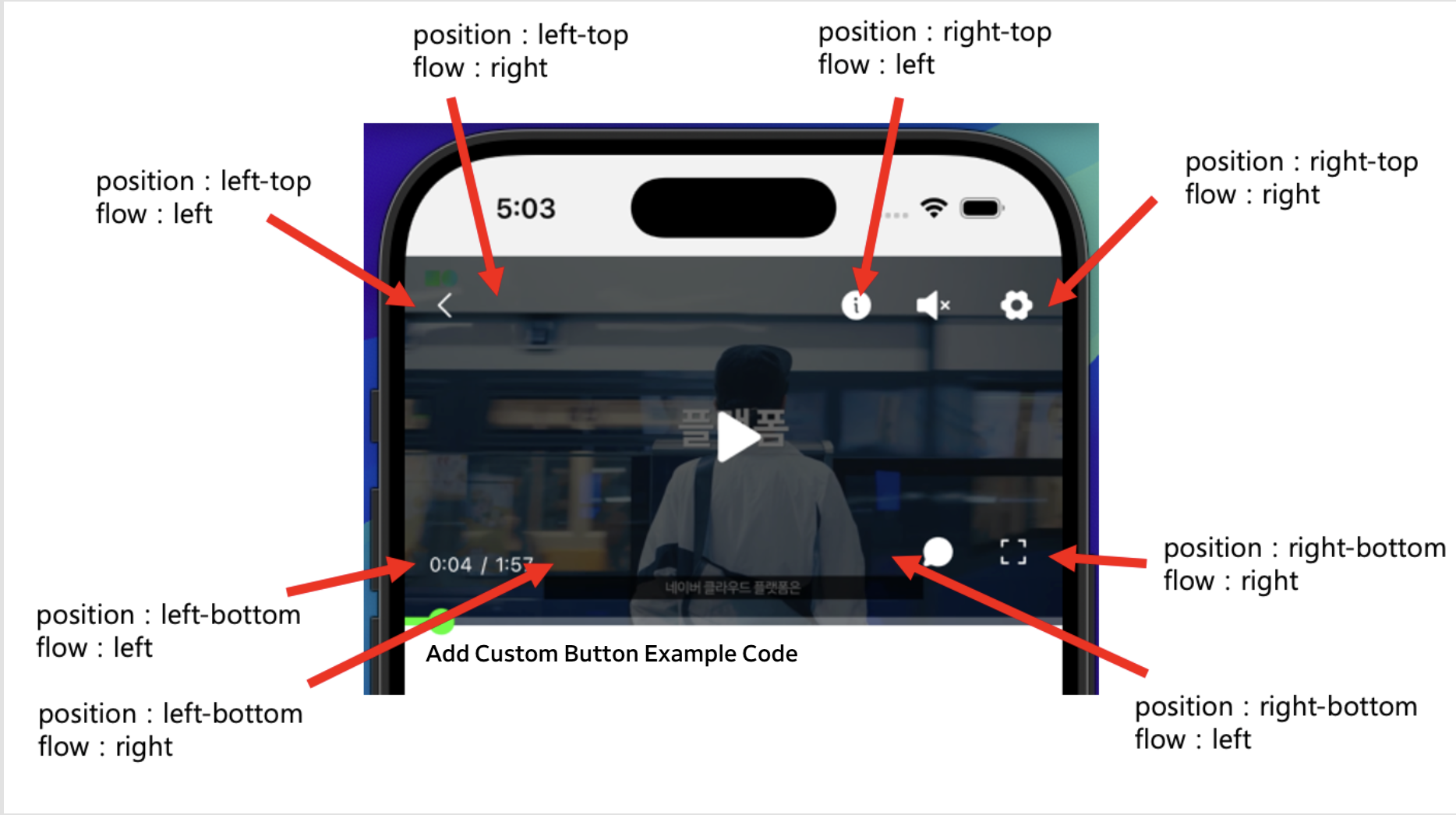
Use the customBtns property to add a custom button to the player and provide a new feature. You can add up to 4 custom buttons regardless of the position.
The positions of the custom buttons are based on the settings of the position and flow properties:
```
{
return (
{
Alert.alert('test11');
}}
>
);
},
},
{
position: 'right-top',
flow: 'left',
button: () => {
return (
{
Alert.alert('test11');
}}
>
);
},
},
]}
...
/>
```